composition
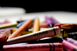
this photo is simplicity because it covers most of the screen there is little to none dead space
this is photo is good lighting and focus because its well focused and no dark spots
this photo is rule of thirds because the clown takes up only the left bottom and right corners
this photo is emphasized foreground because the ground takes up 2/3 of the picture
this photo is emphasized height and distance because the sky takes up 2/3 of the picture
this photo is leading lines because the bead necklaces leads your eyes along the screen
this photo is multiple subjects because there is multiple subjects
i was able to meet this objective because is trying new cameras I've never used be for and i went out my way while i was out side to take the pictures needed. i feel like my strongest photo was the simplicity photo and and my weakest is the leading lines because my strongest is more focused and i put more time into it and my weakest is the leading line photo because i kinda rusher it and put only two things.


Simplicity is incorrect. Don't have any distracting elements in your picture. Text is a big distractor.
ReplyDeleteEverything else is correct!
Be careful not to over edit the color. You don't want to blow out your whites where they are so bright you lose detail..
Good job!